App Link
Shiny Apps Project 2 LinkIntroduction and Description
Project 2 is a project focused on learning how to develop shiny app web applications for data manipulation and visualization. However, Project 2 adds onto the concepts covered in Project 1 and adds more complex graphing capabilities especially when it comes to maps. Some of the things covered within this app is learning how to import data, manipulate said data and then create a user interface for visualizing the data with leaflet maps.
The project focuses on visualizing the energy that is used within the US and looking at the data over time as well regionally. There is a focus on 10 resources overall: Coal, Hydro, Natural Gas, Oil, Wind, Biomass, Nuclear, Geothermal, Solar, and Other.
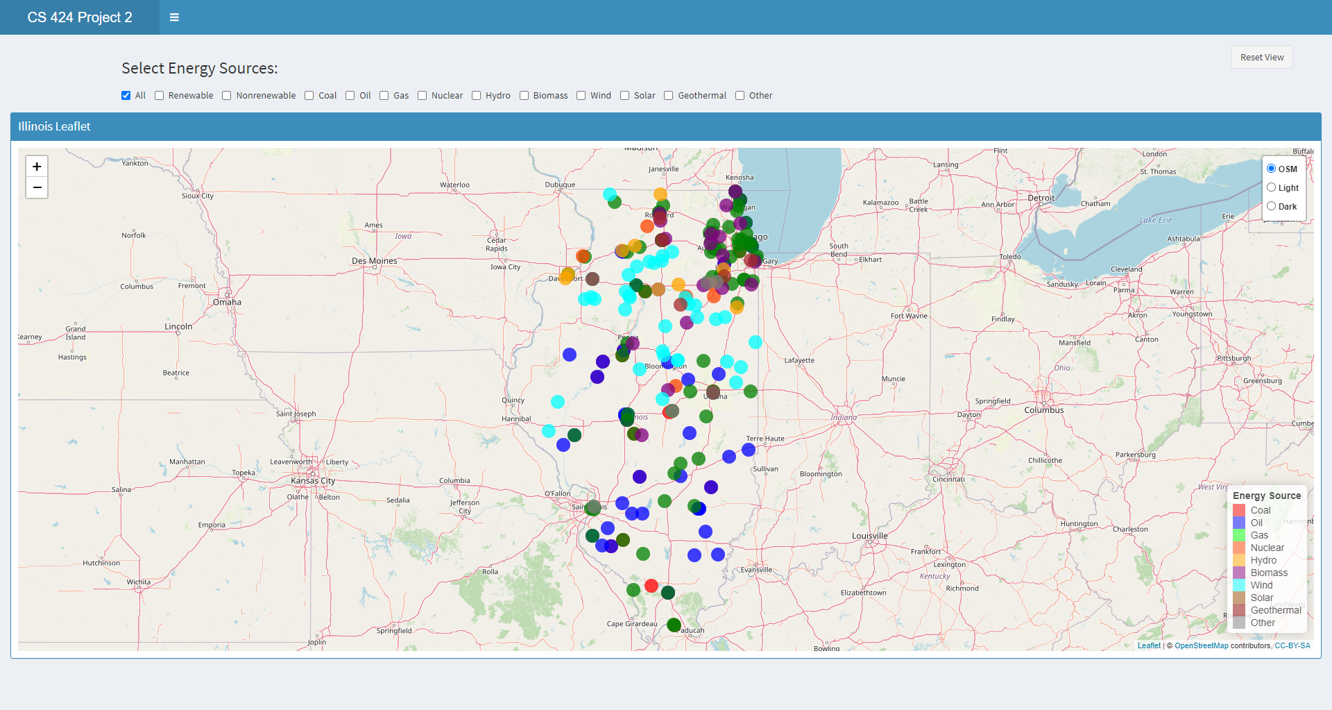
The first page displays the power plantations within Illinois in the year 2018 and allows the user to toggle through the energies and see which plantations are more abundent and where they are located.
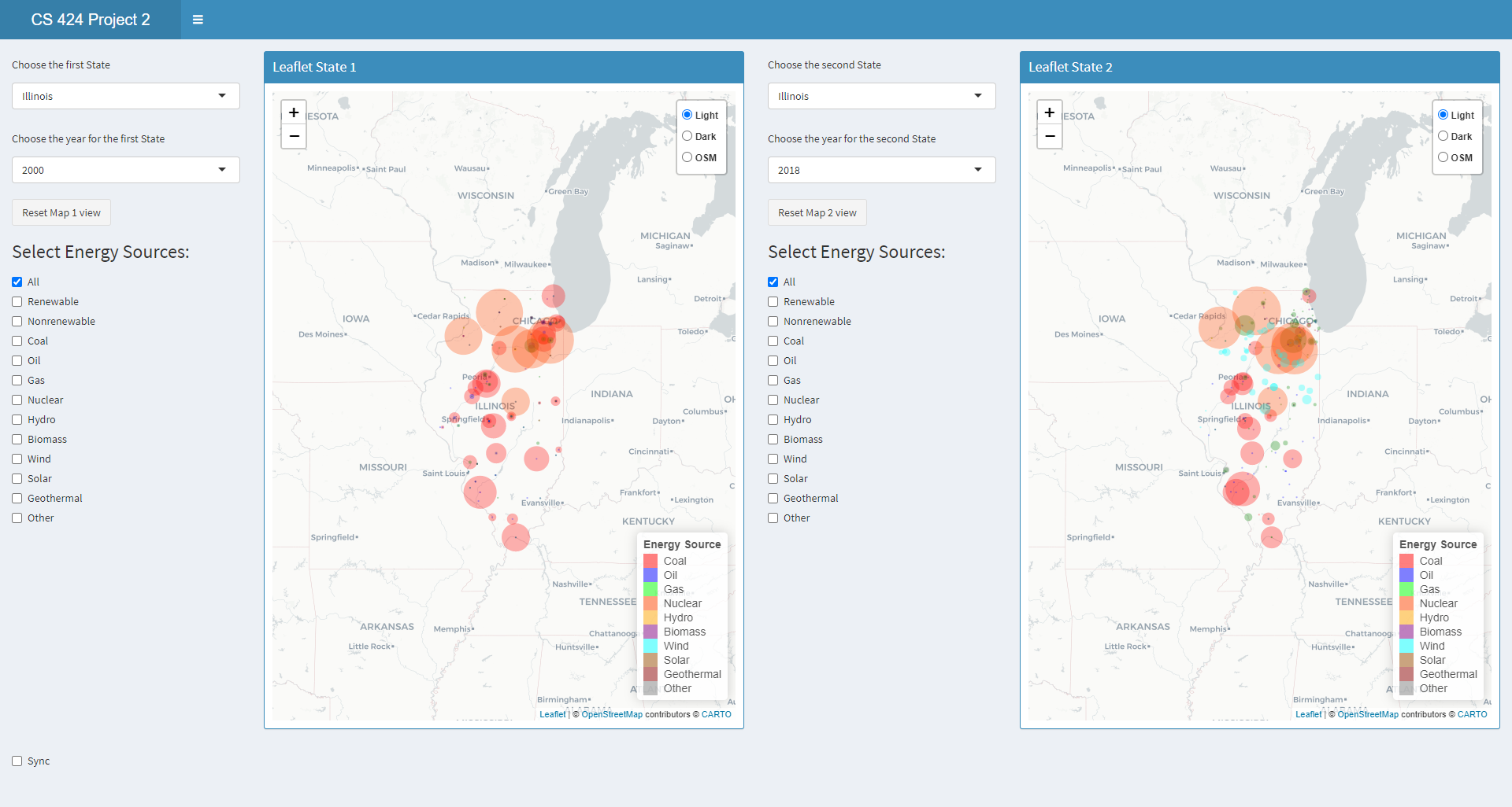
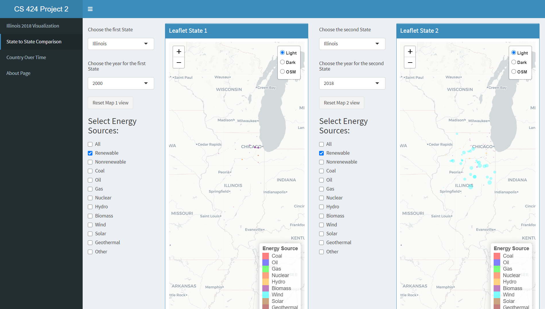
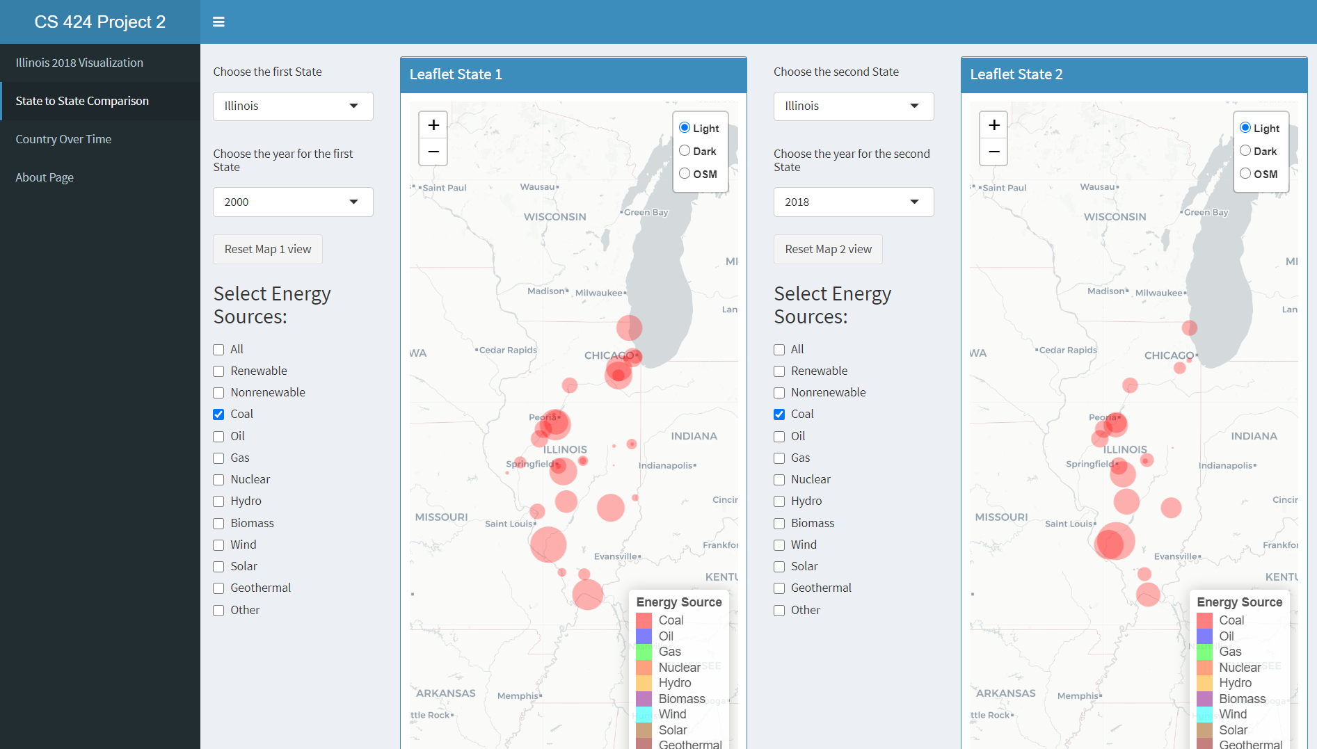
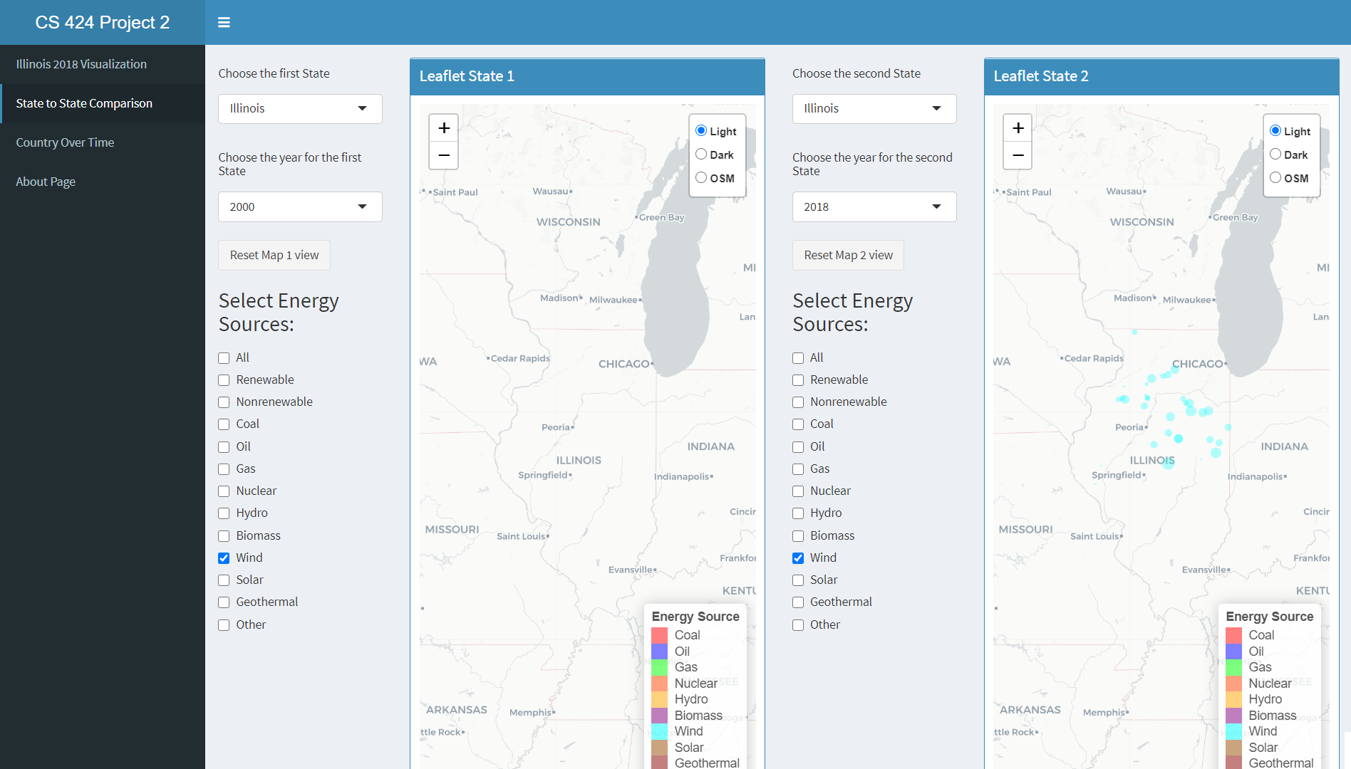
The second page allows the user to interact with two different regions and they are allowed to choose energy sources to compare between. They are able to select the same location and compare the same source over time or different sources in the same time frame for instance. The user is also able to select multiple different energy sources, two different time periods, and two different locations for comparison. The data displayed shows leaflet plots for change in time as well as contribution. The leaflet plot allows for the user to see the actual contribution of each plant by hovering over and clicking each plant and seeing the visual size of each plant contribution.
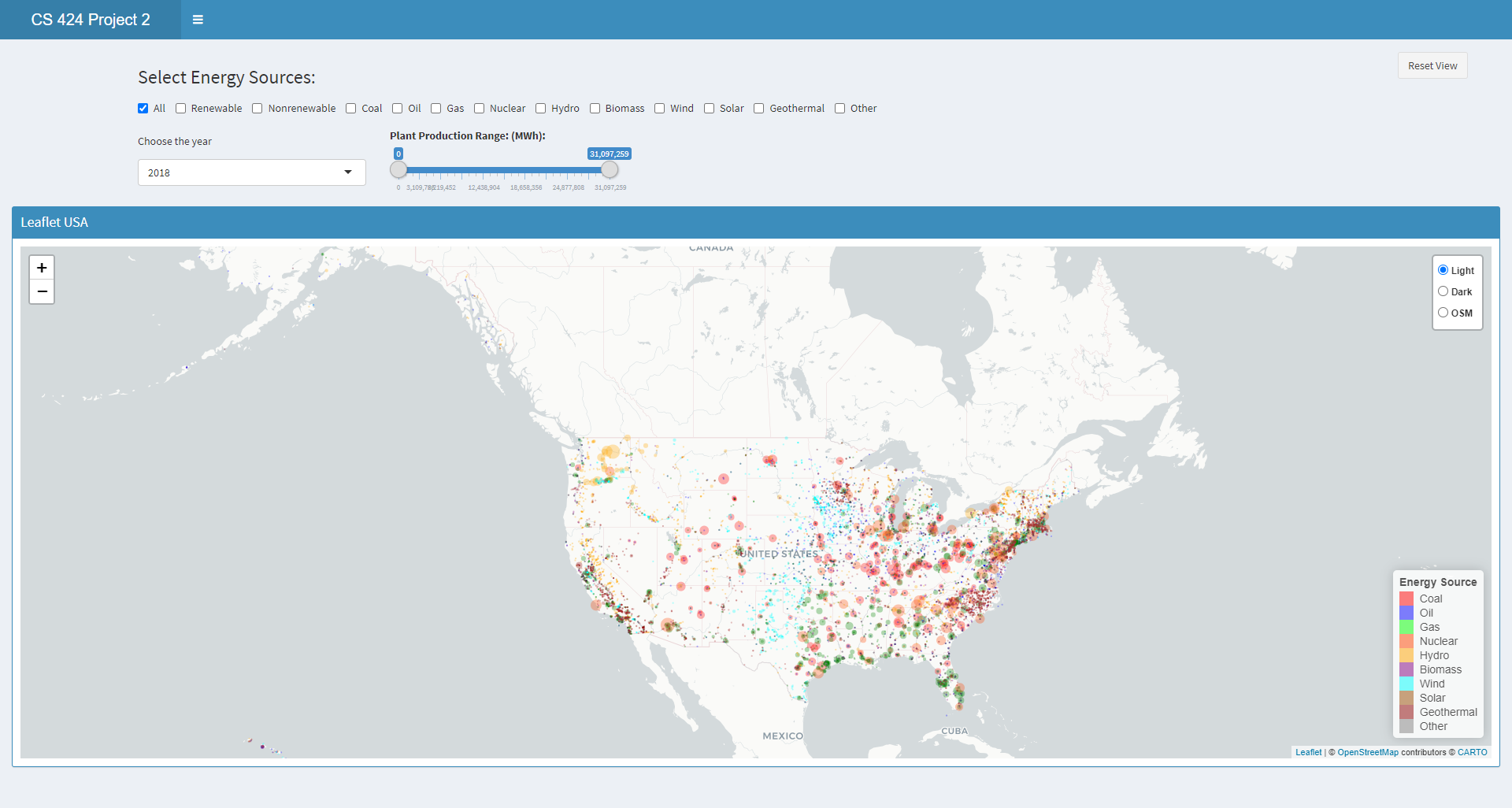
Finally the user is allowed to compare the energy sources by a range of production values while looking at the US holistically.
There is an about page on the fourth tab.
Data Processing
The data was collected from the US Energy Protection Agency. The dataset was the net generation of energy organized by State and Type of Producer and Plant Coordiantes. The website had data for almost every year so a more indepth time series could have been performed.
The initial data manipulation done to the dataset involved cleaning up the dataset such that it was easier to handle and more focused on the information trying to be collected.
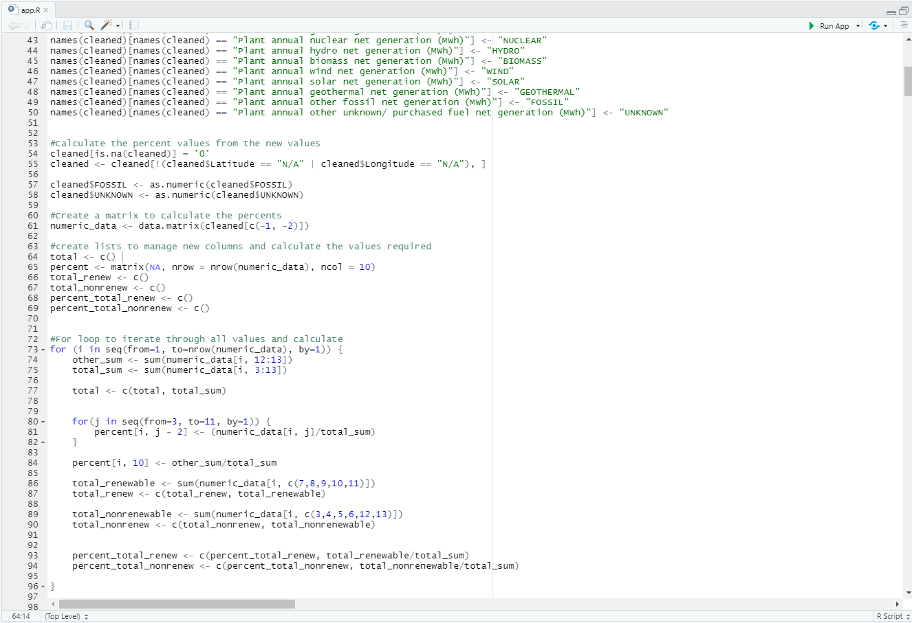
The first steps in cleaning up the data involved converting the dataset to the proper format. In this case certain features such as the GENERATION column was read in as string where in actuality it was a numeric value used to measure the production amount for the data. The other columns were converted to be more friendly values by converting them to factors.
The second step involved missing data and incorrectly labeled data. There was a lot of missing data that needed to be filled in with 0s. The data was also problematic as it had minor issues here and there that led to issues with the information being problematic such as the longitude values being negative which needed to be adjusted.
The final measure was calculating the percents for each type of energy source and calculating those values for all the dataset.
Instructions to operate
Github Project Repo
To run this project there are a few requirements:
1) Correct libraries and proper library versions
2) Downloading the repo and opening the R project to start an R-Studio session
3) Going to https://www.epa.gov/egrid/download-data
4) Downloading the data for 2000, 2010, 2018
These instructions are enough to get the project working, however to make sure everything is compatable it is assumed that you have R-Studio and Shiny Apps already installed. Otherwise the user will need to install said software beforehand. There are a lot of libraries involved within the project so it is best to have everything up to date with this project.
The libraries include:
library(shinydashboard)
library(shiny)
library(leaflet)
library("readxl")
library(rgeos)
library(maps)
library(mapdata)
library(maptools)
library(ggthemes)
library(ggmap)
library(sp)
library(stringr)
library(plyr)
Interesting Features
The data showed interesting trends in terms of the growth in energy and specific usages of energy. Historical technological growth and environmental preservation motivations are easily seen in the data. Another thing that can be seen is the lack of natural resources and drop in their usage overtime.
The most notable trend that you can see is overall growth in all energy forms but specifically renewable energy becoming a large factor for energy production within the US.
There is a drop off in some energy sources that can be explained with an increase in other more green technologies. With a larger focus on remaining environmental friendly some energy sources have been utilized more and other energy sources are dropping off.
For instance when looking at energy sources such as coal and its usage over time you can see that there were more plantations to created but the overall production capability of the coal plantations were reduced. However, wind across Illinois went from nonexistent to becoming heavily used in the span of 2000 to 2018.
In contrast energies like solar, hydro, and wind sky rocket in usage in the more recent years to compensate for energy production that nonrenewable resources have dropped off in.